Key Takeaways
- 01A professional HVAC website should feature clean design, easy navigation, and prominent call-to-action buttons
- 02The best HVAC websites use color schemes from their logos to create cohesive branding
- 03Contact information and scheduling options should appear above the fold for easy access
- 04Mobile-friendly design with testimonials and clear visual hierarchy converts more visitors into customers
- 05Successful HVAC websites balance comprehensive information with simple, uncluttered layouts
Building an HVAC website would be one of your best decisions since you are reaching your customers on their handy device or a personal computer; they don't need to visit your brick-and-mortar. Your HVAC website should be designed to define a clear visual hierarchy. There should be a clear call to action button, a format for contacting the business on its website, a social media link, and many testimonials. Also, you can follow the latest HVAC blogs or trends that help you to create your website SEO-friendly as well as mobile-friendly that help you to generate more HVAC leads. When you offer such prompt services, you win clients quickly. But how would you build an HVAC website and create useful HVAC blog topics? Well, this article offers you some of the best HVAC websites to consider when building an HVAC website. Get the key points of each website to build yours and win customers quickly.
Table of Content
Best HVAC Websites for Inspiration
1. East River Energy
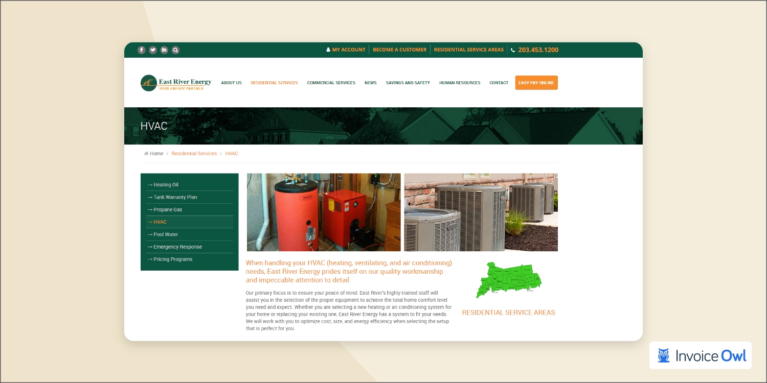
East River Energy's website is professionally designed and has a clean and neat appearance. As you scroll down the page, you will notice an easy-to-navigate navigation bar that allows you to explore the company's commercial and residential services or even delve a little deeper into the company's history. Throughout the site, the HVAC company's logo is featured in green and orange, with excellent use of colors.
Having estimating and invoicing software is the cherry on the cake for your HVAC website. Consider integrating tools that streamline operations and enhance customer experience directly from your site.
2. Custom Heat Limited
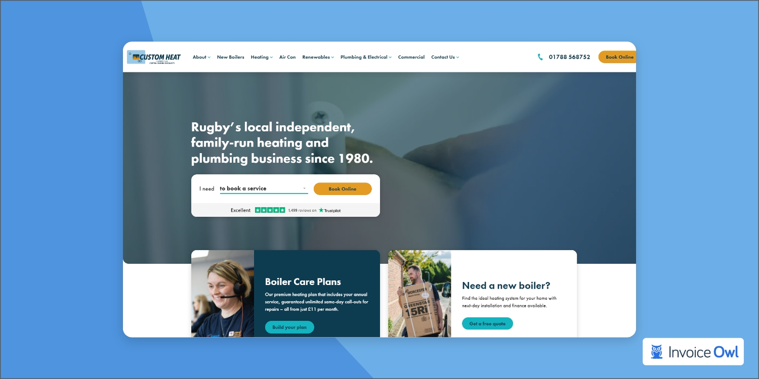
Again, you are drawn to the appealing design due to its simplicity, cleanness, and simplicity. With a white background contrasting with darker shades and paler shades of blue, the background is clean so that you have an easier time focusing on the information you need to make your HVAC system run properly. With its above-the-fold contact info, including a phone number and a prominent gold call-to-action button. Custom Heat offers easy navigation for those who wish to contact the team at Custom Heat immediately.
3. NRG Heating & Air Conditioning
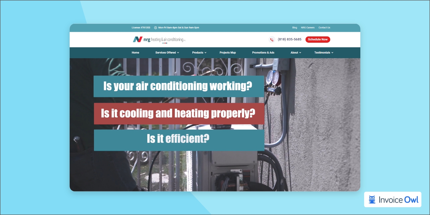
The use of a clean, white background is a recurring theme on websites, as well as the use of colors from the company logo to color the website. A bright red "schedule now" CTA button, including NRG's contact information, appears above the fold. The homepage has a comprehensive layout that you like. The design also contains another large CTA button, which compensates for the navigation that does not scroll with the user at the top of the site, which is a bit of a letdown.
4. BrainBox AI
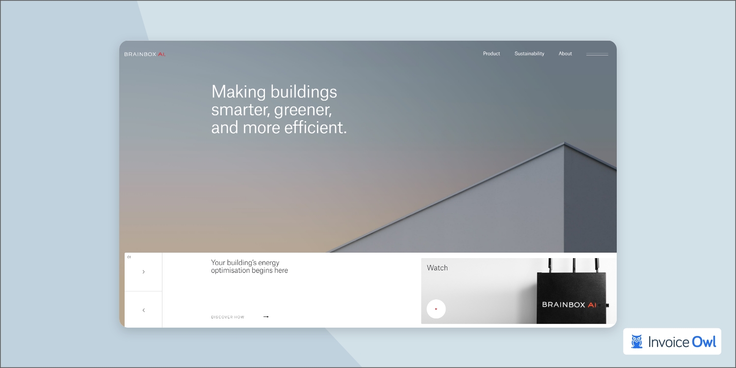
Seeking more design options to design a highly satisfying website that brings the customer? Well, BrainBox AI is the one you can take inspiration from. Its website's design elements demonstrate the company's commitment to quality, and those elements are different from what we've seen thus far. A large graphic on the homepage of BrainBox showcases clean buildings, complete with video elements. Users can navigate the site satisfyingly and impressively thanks to the sophisticated navigation.
You see a red call-to-action button that says "let's talk" as you scroll down. A button on the BrainBox website allows you to contact the team by clicking it. This is quite an effective way of using a call to action button, and it matches the website's design quite nicely. As a result of the bright red box striking contrast with the rest of the website, it is already tough to miss it.
5. Bob Hamilton
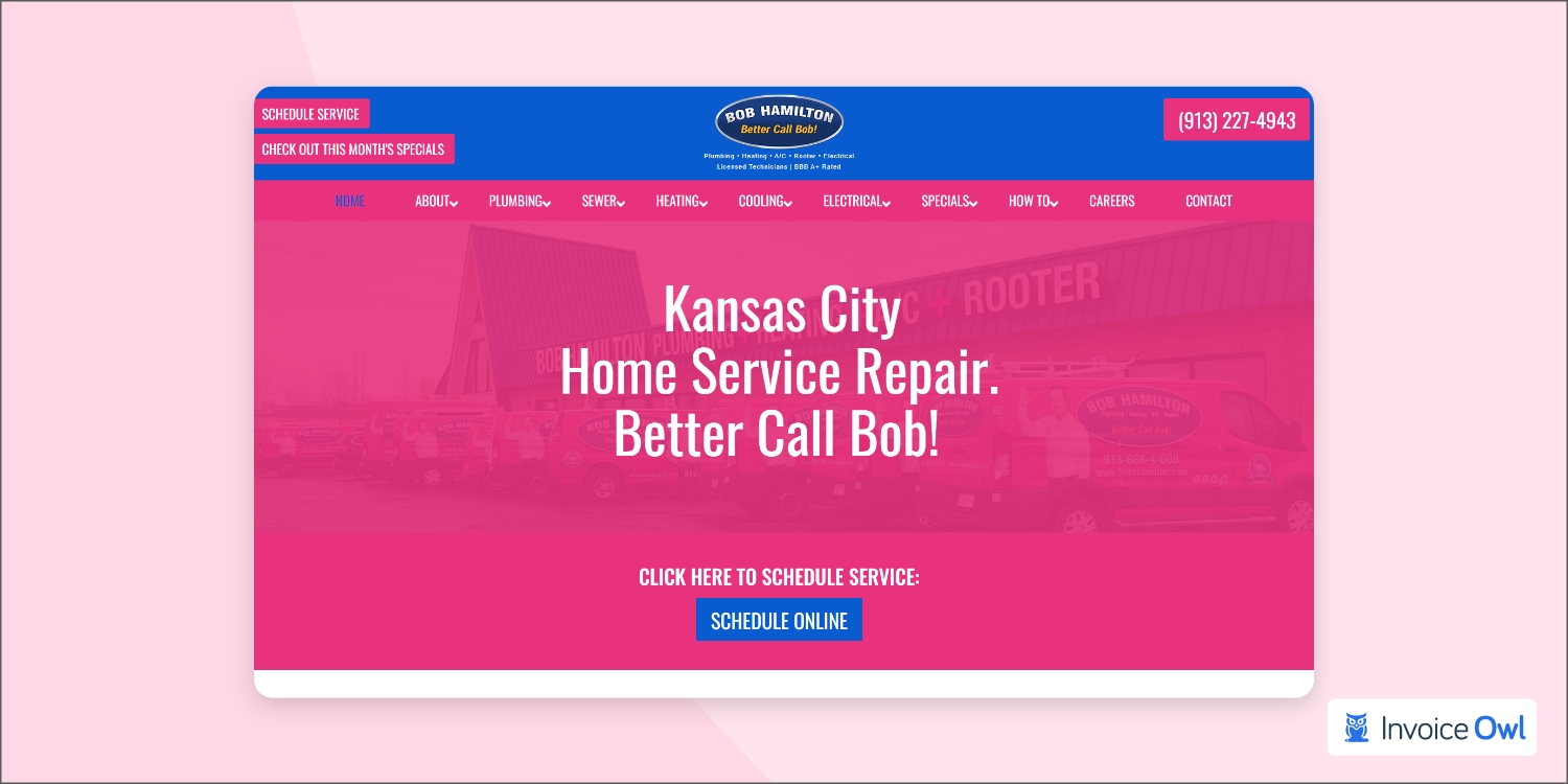
While searching for excellent HVAC website design examples, you cannot overlook the design of Bob Hamilton Home Services. It is also assumed that their website design has converted visitors into customers. This website design is so simple and sober that no visitors will face challenges in navigating the website. Instead, their contact form option is placed so nicely for seamless communication. So if you plan to design a website with a limited budget, then taking inspiration from this website will significantly help.
6. Air America
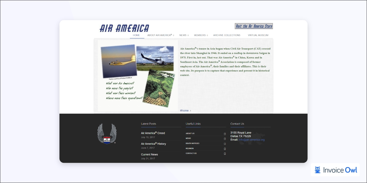
There is no doubt that Air America is patriotic and has the colors to prove it. When it comes to its website layout, it's equally appealing that it not only attracts the visitor's attention but eases the contact process for you. This is a good website in general, and it is clean enough for everything to be clear, and scheduling is made easy thanks to the calendar function. If you plan to get inspired from the website, Air America is great to get inspired from, and use the same plan to see how great an impression it makes to your customers.
7. Skylake Heating & Air
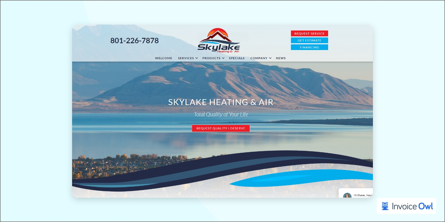
With a simple and clean design, Skylake Heating and Air boast a consistent design scheme that shows off the area's beauty in its clean and simple website design. With the chat feature, there are several ways in which you can get in touch with the business, which makes it even easier for you. In addition to getting a quote, an estimate, obtaining financing or just chatting, you can also request service.
You must be aware of the old saying, "First impression is last impression" this is not just saying, and this applies to the real world. So start planning the core things and convert visitors in one go. You can even automate the quote sending process with InvoiceOwl that is the best app for hvac business, so you do not have to worry about other operations. You focus on what elements make your website worth noticing.
8. AC Repair Las Vegas
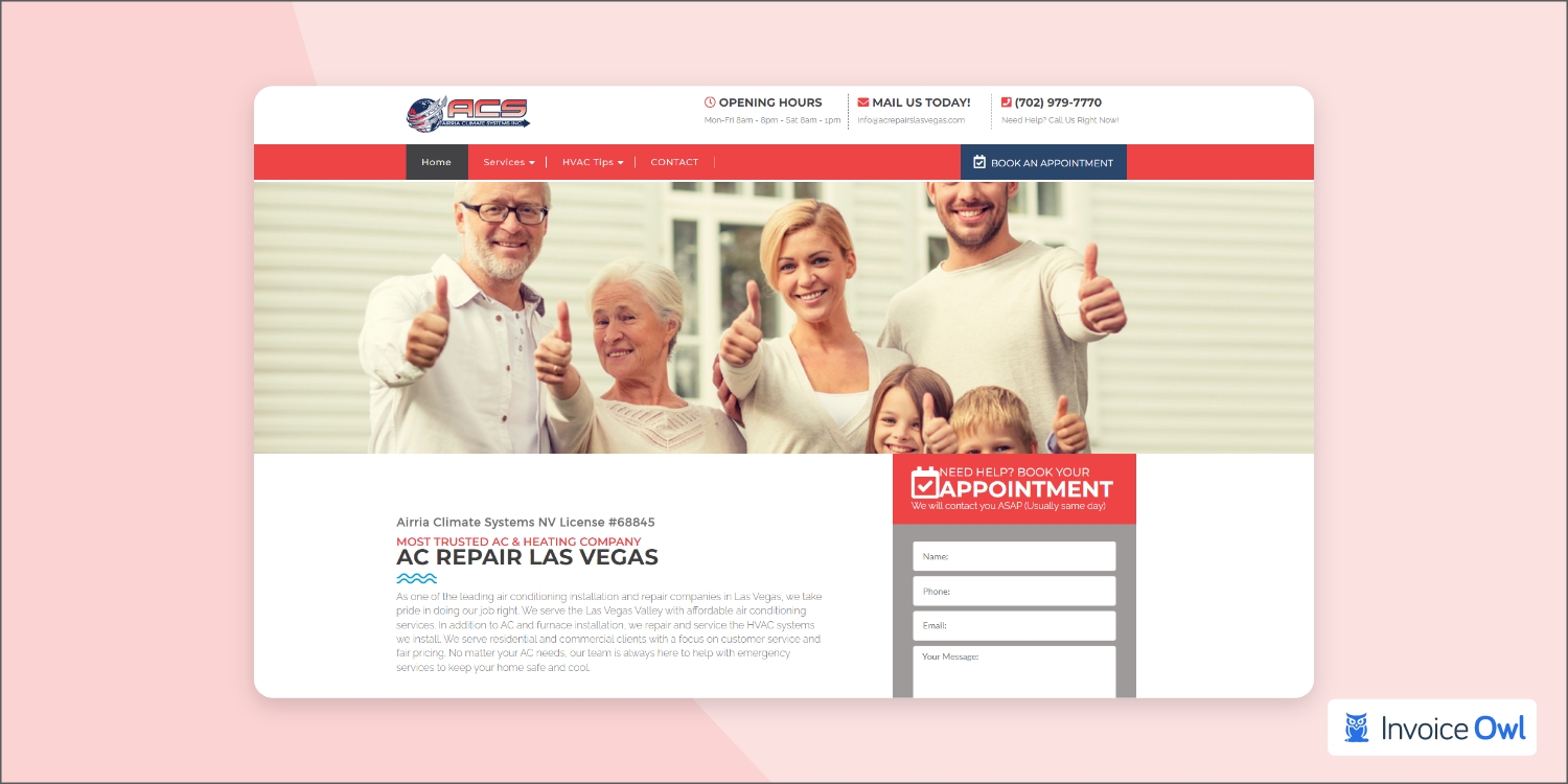
As a website for an HVAC company, AC Repair Las Vegas website ticks many of the boxes, one should expect from such a site. A list of the company's social media pages appears at the top of the page. Above the fold is a call-to-action button that will allow you to schedule your appointment. Alternatively, you may use the handy form above the fold to enter your contact information and those you already put in. It is an excellent feature of the AC Repair Las Vegas website, showing photos of families and actual HVAC technicians to humanize the HVAC system. In short, it is an excellent website design example that is worth taking inspiration from.
9. Brock's Heating, Air Conditioning & Gas
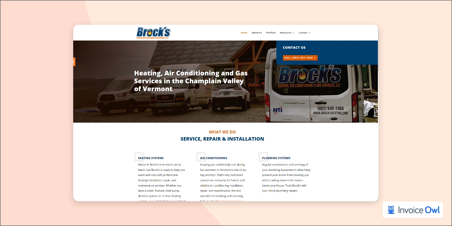
So ready for the next web design example? That is sure to be Brock's Heating, Air Conditioning & Gas. It is designed in a way that lets them stand out from the competitors. This website uses orange CTA buttons against blue bars and other graphic elements, mimicking the logo's orange and blue color scheme. On the homepage, testimonials sweeten the deal, and the navigation bar moves as you scroll.
10. AC Heating and Air Conditioning Services
The design of your website shouldn't look crowded, even if you plan to include a lot of information. This HVAC website design from AC Heating and Air Conditioning Services of South Carolina demonstrates the right way to design an HVAC website. To navigate the site, there are two navigation menus available. The first menu has an option for making a payment, scheduling an appointment, and reviewing your review. All the standard drop-down menus are included in the second navigation menu, including one for an about page and another for services. Whether you're viewing the testimonials, the company's services, or the special offers, the menus scroll as you do. In addition, as seen in the HVAC company logo, a simple but effective color scheme of dark red and white enhances the cohesiveness of the site.
The best HVAC websites share common traits: scrolling navigation menus, multiple contact options, testimonials prominently displayed, and color schemes that match the company logo for brand consistency.
11. Complete Climate Services
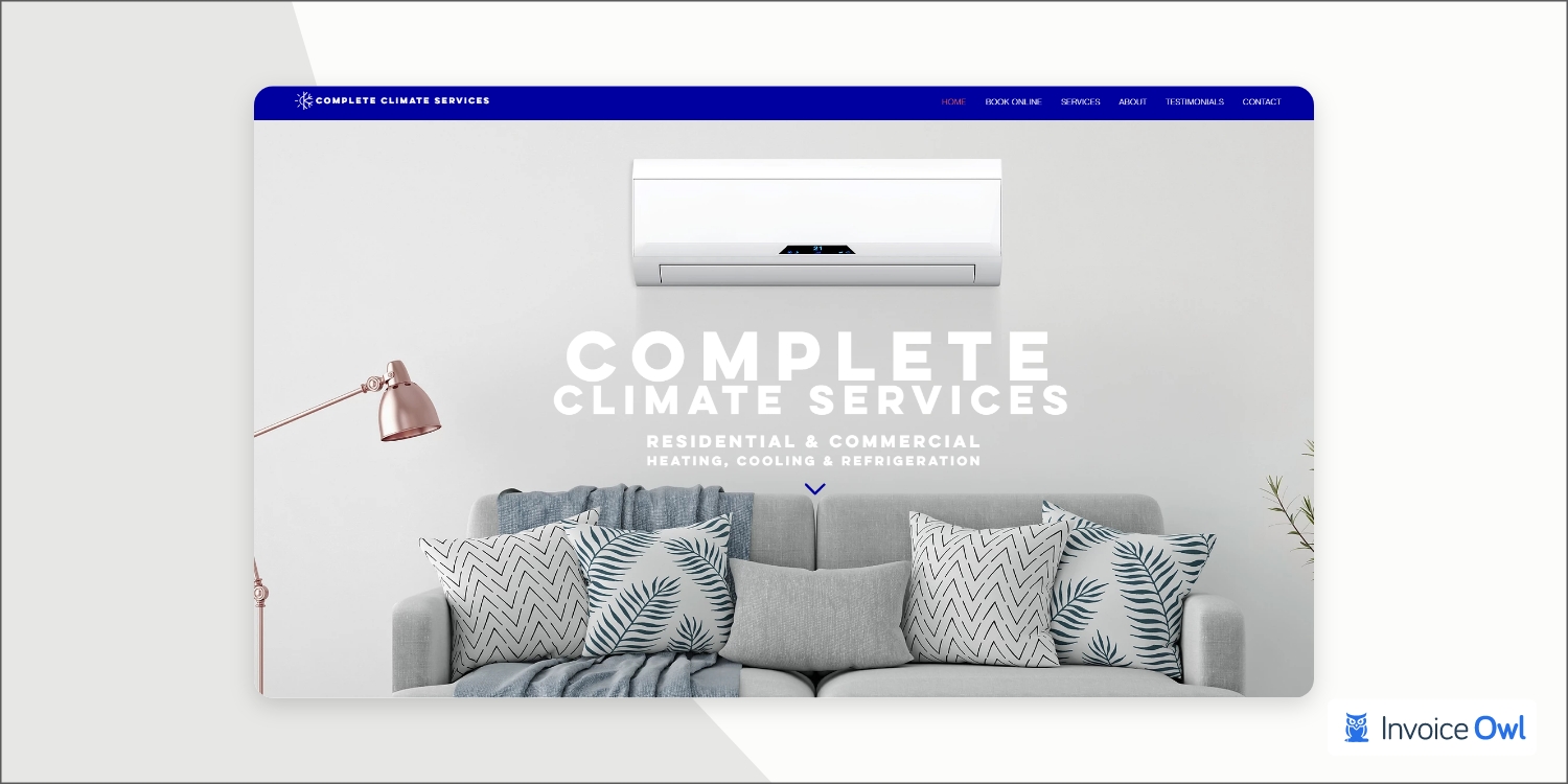
Even though Complete Climate Services may perform fantastic work, they also understand that one of the most important things you can do for your HVAC business is to invest in an excellent HVAC website. Upon reaching the bottom of the page, you're greeted with a simple, beautiful color scheme. This website could use minor improvements here and there, but the visuals are well put together and show what you are trying to convey. Don't wait any longer now, and start implementing this website design to your HVAC business website.
12. Carini Heating, Air and Plumbing
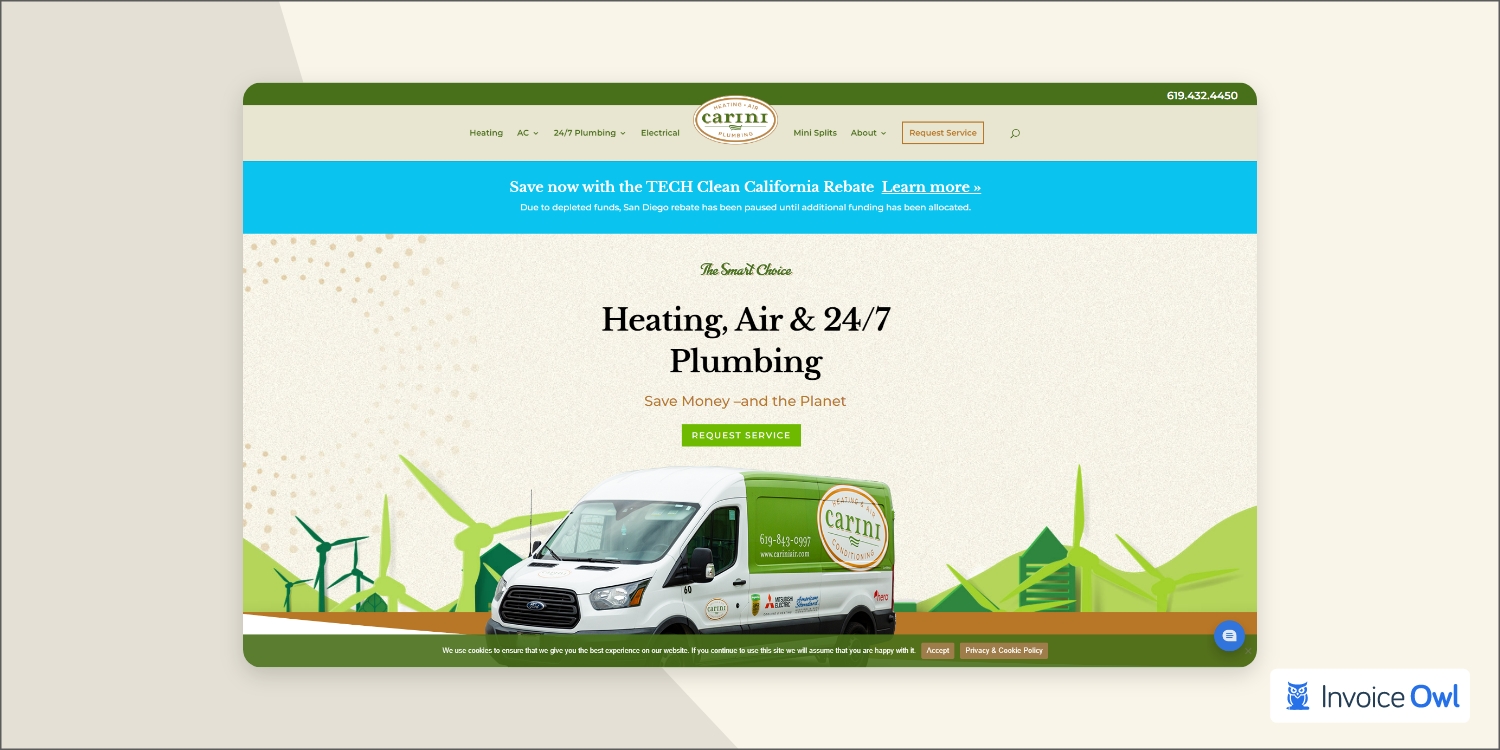
There is an option for infusing more color into your HVAC website design. For inspiration, visit the Carini Heating, Air, and Plumbing website. This site has a cheerful feel with teal blue, neon green, spring green, and beige colors. Traveling through the Carini website is a pleasure, thanks to the well-designed navigation and clean graphics.
13. Premier HVAC Services
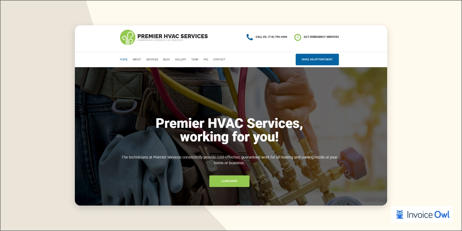
How do you differentiate yourself from other HVAC companies in New York City? You must have a website that stands out from the rest, like Premier HVAC Services. Authenticity is promoted on the site's homepage by promoting Premier HVAC Services as locally owned and operated. Whenever you scroll down the page, this navigation menu appears with a blue CTA button that allows you to book an appointment.
Essential Features for HVAC Websites
Take Your HVAC Business to the Next Level
A great website attracts customers, but streamlined operations keep them coming back. InvoiceOwl helps you create professional estimates and invoices on the go—trusted by 55% of HVAC contractors.
Start Your FREE TrialFrequently Asked Questions
A common factor among the best HVAC websites is what makes them so great. As you prepare for the design of your heating and cooling website, there are some things you should consider and include:
- Describe what makes you different from the rest
- Provide customers with a quick way to contact you
- Provide pricing information when possible
- Don't get too complex with your design
- Feature customer testimonials prominently
- Ensure mobile responsiveness
Several key features are common among the best HVAC websites. First, their professional designs make them appear trustworthy to potential customers. The second thing is that they all have detailed information about their HVAC services with clear descriptions and pricing when applicable. Finally, they all feature simple contact forms so customers can reach out to them easily, along with prominent call-to-action buttons and multiple contact options like phone, email, and chat.
A great piece of content makes websites stand out. Get great content on your HVAC website. Potential customers can find something intriguing on your website that will make them stay. Engaging your visitors requires great content on your website, combined with clean design, easy navigation, authentic photos of your team and real projects, and testimonials from satisfied customers.
Absolutely! Most customers search for HVAC services on their mobile devices. A mobile-friendly website ensures visitors can easily navigate, read content, and contact you from any device. This is essential for converting visitors into customers.
Call-to-action buttons are critical for converting website visitors into customers. They should be prominently displayed above the fold, use contrasting colors that stand out, and offer clear actions like "Schedule Now" or "Get a Free Quote." Multiple CTAs throughout the page help capture visitors at different stages of their decision-making process.
Conclusion
It is critical to design HVAC websites to motivate visitors to take action, such as making an appointment. As far as the website is concerned, it should be clean and mobile-friendly with plenty of testimonials, graphic elements with eye-catching effects, easy navigation, and a user-friendly interface. By studying these 13 best HVAC websites, you can identify the common elements that make them successful—professional design, strategic placement of contact information, prominent call-to-action buttons, and cohesive branding through color schemes.
Remember, your website is often the first impression potential customers have of your business. Invest in making it count by implementing these proven design principles and pairing it with the right business tools to streamline your operations from inquiry to payment.

